Gallipolis MCC Magazine Ads
The ads are full page and full bleed with headlines, placeholder text, and a call to action. The name and logo are at the top of each ad. The first ad represented cancer care and the second ad, an orthopedic group.
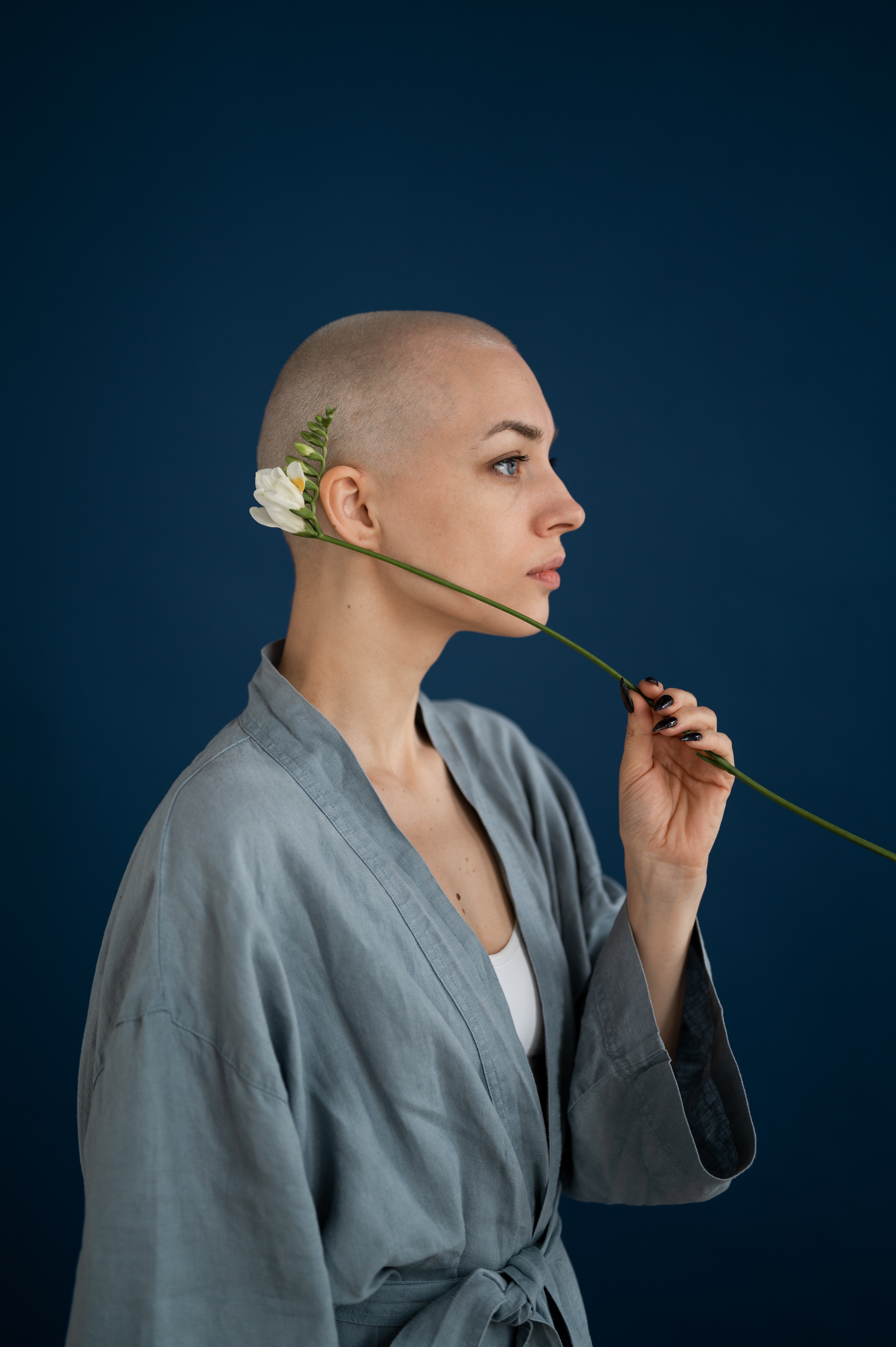
Gallipolis Cancer Care Center
The cancer care ad represented the Gallipolis Cancer Care Center. The logo for the center brought together a combination of a cancer ribbon and a person. I combined the two for a more personal touch to the cancer center. The ribbon encompassed a woman in for treatment. The ad featured the headline, “Designed with you in mind.” This headline signified the prioritization of the client. The 24/7 availability of trained professionals showed the center provided transparency throughout the healing/surgery process. The call to action repeated the importance of the center’s personal approach to cancer care. The contact info displayed below the body text for the ad. I removed the fax number because the client wouldn’t likely fax their information directly to the center. Myanmar MN Regular and Bold showed in the ad in 18pt, 14pt, and 10pt. The image is a free picture from pexels. Three main colors made the ad cohesive in color palette. The calmer blue/grays made the patient feel at ease and showed a different side of cancer care, the calmer and more personal care side.


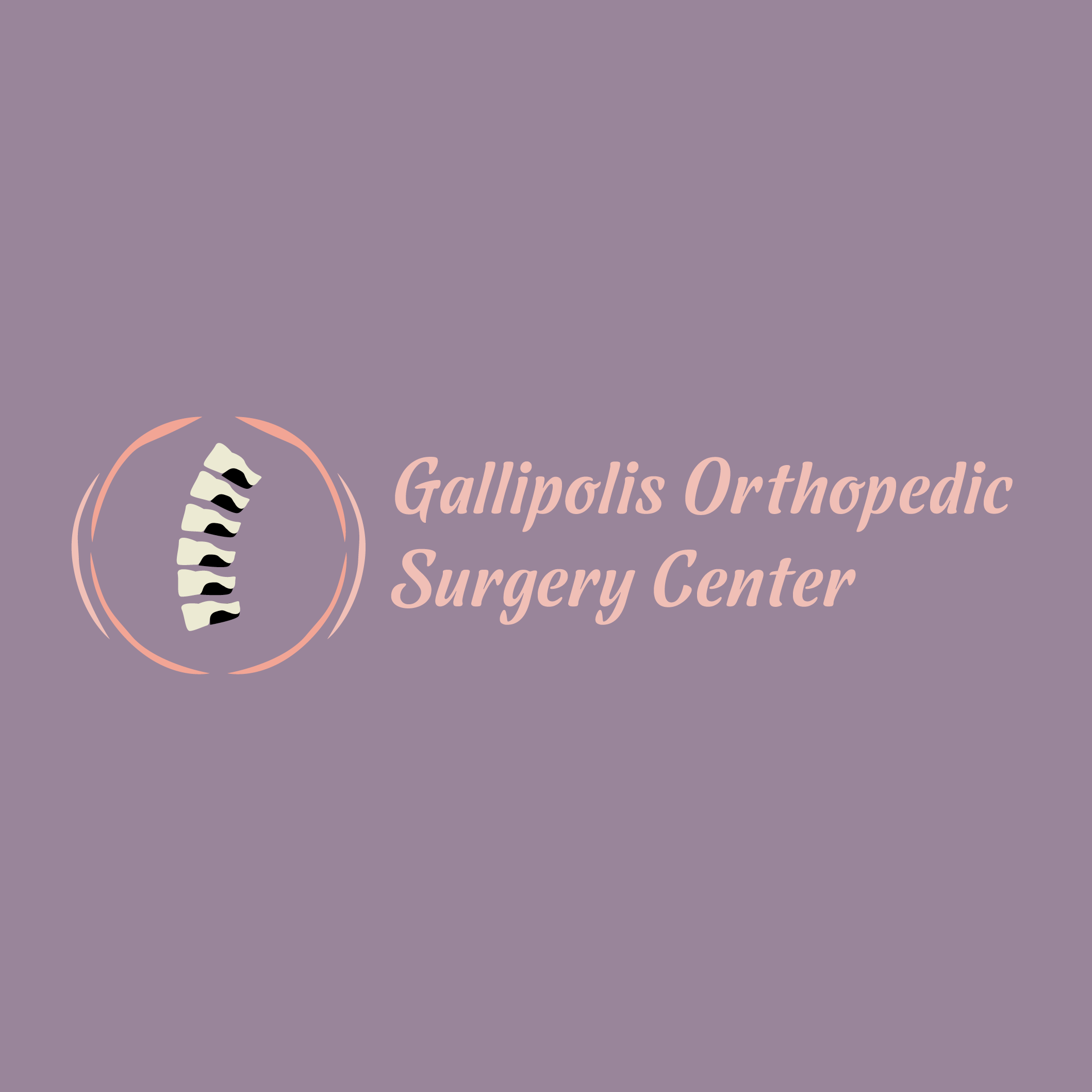
Gallipolis Orthopedic Surgery Center
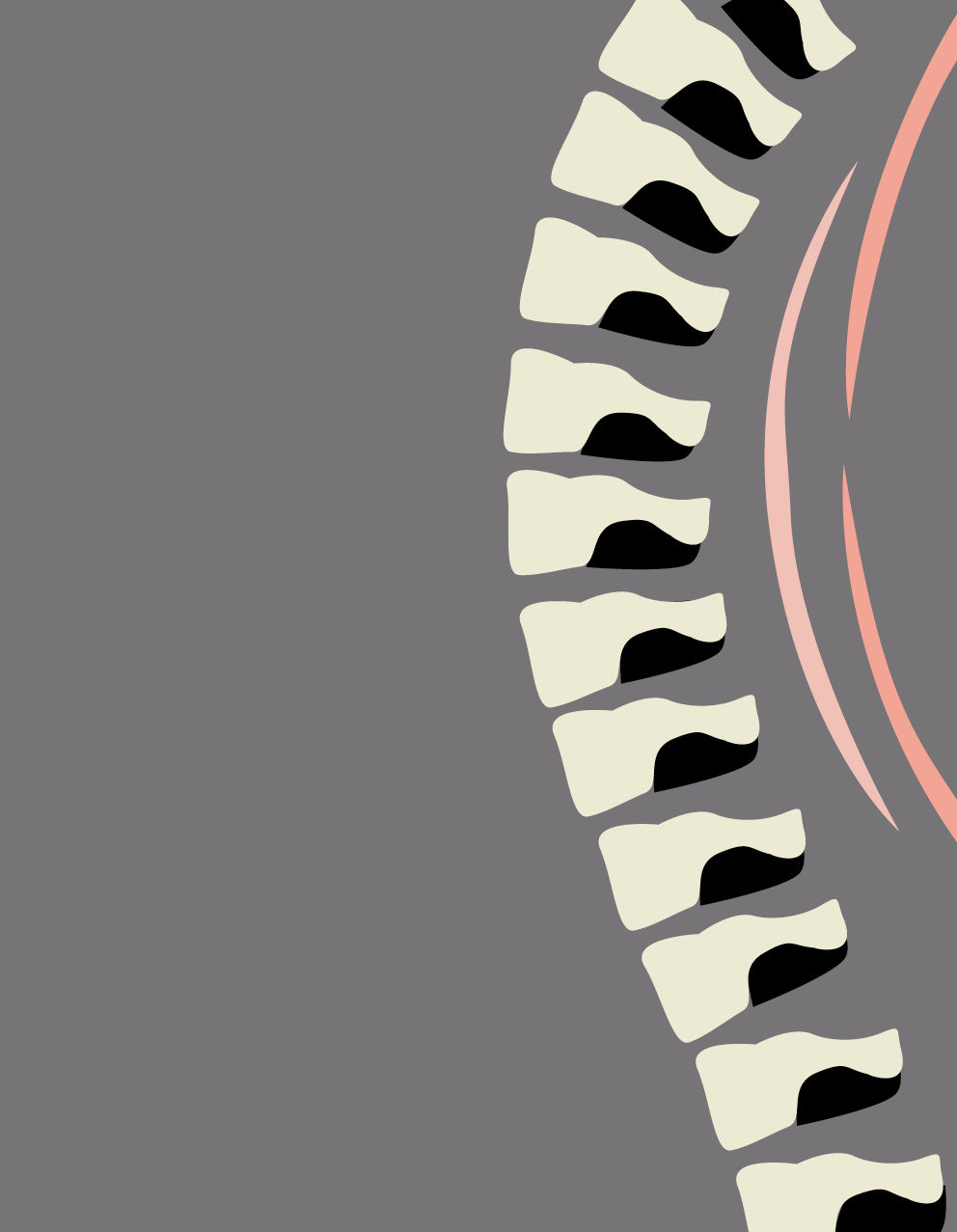
The orthopedic group ad represented the Gallipolis Orthopedic Surgery Center. The logo for the center featured vertebrae and muscle forms to provide visual explanation of the center. I represented surgery or examination elements without using graphic photos. The vertebrae showed elements of a piano to match the Headline “Keep your body in tune with us!” The headline linked to the call to action and showed overall cohesive language. The next paragraph began with serving the community; it showed the center supports the community. The call to action linked to the headline to keep the client in tune. This call narrowed down the surgery specialty here as back surgery. Ideally, this would be a series that features different body parts for individual magazines. The ad for each magazine would be based on surveys of what magazine ads bring the clients to the center. The contact info is listed below the body text for the ad. I removed the fax number because the client wouldn’t likely fax their information directly to the center. Dessert Script Regular were used in the ad in 18pt, 14pt, and 10pt. My design of vertebrae in the spine and representation of abstract muscle forms worked as one of the ads in the series. Five main colors made the ad varied, yet cohesive from the bone and muscle color theme.

Ad Similarities and Differences
Both ads showed different approaches to ad design. The cancer care ad focused on a personal photographed approach, while the orthopedic surgery center focused on illustrated elements. Also, the ads varied in color palettes with one being cooler and the other is a warmer palette. The ads displayed a few similarities. Similarities included sizes of type on the headline, body text, and contact information and left aligned type on each ad. The logos are similar in orientation with the design to the left and the name of the center follows the design. The logos are both featured at the top of each ad.
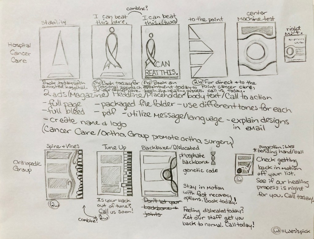
Process Sketches